Project Overview
Help Home Care (HHC) is a boutique senior care startup with an ambitious vision: to disrupt the eldercare space and compete with much larger healthcare organizations. Their mission is simple yet profound: helping older adults live joyful, fulfilling, and dignified lives as they age.
As the sole UX Engineer on this project, I was responsible for creating a comprehensive brand identity and digital presence capable of standing alongside enterprise competitors while preserving the warmth and personal connection that define a boutique care provider.
My goal was to bridge the gap between enterprise-level professionalism and deeply human-centered care.
The Challenge
Families searching for senior care are often navigating emotionally difficult circumstances. They need reassurance, clarity, and trust almost immediately.
To establish credibility and differentiate HHC from larger competitors, I focused on two strategic pillars:
Enterprise Credibility
Build confidence through intuitive user experience, accessibility, healthcare-informed design practices, and a professional visual identity.
Warmth
Create an experience centered on empathy, personal connection, and community. Qualities often absent from large corporate healthcare brands.
My Role
As the project’s UX Engineer, I worked across the entire product lifecycle, including:
- Brand Identity & Logo Design
- UX Strategy & Information Architecture
- UI Design & Component Systems
- Typography & Visual Direction
- Content Strategy & Messaging
- Front-End Development
- Accessibility & Performance Optimization
- CMS Configuration & Client Training
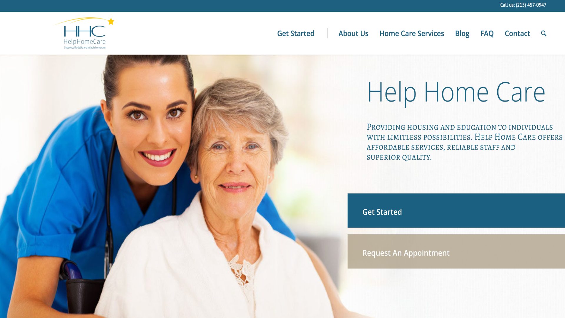
1. Brand Identity & Logo Iteration
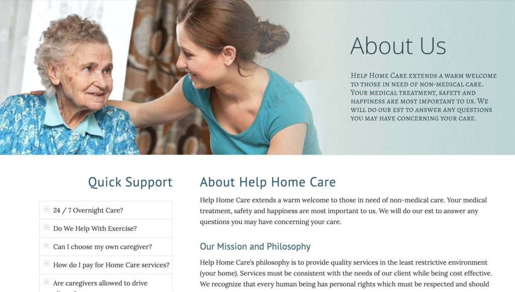
The logo needed to communicate trust, care, professionalism, and home.
Working collaboratively with stakeholders, I guided the brand through multiple iterations:
Iteration 1: Emphasized healthcare and professionalism but felt overly clinical.
Iteration 2: Explored a more abstract direction but lost immediate recognition and emotional clarity.
Iteration 3 (Final): Balanced shelter, human connection, and professional care into a cohesive visual identity that aligned with the company’s mission.
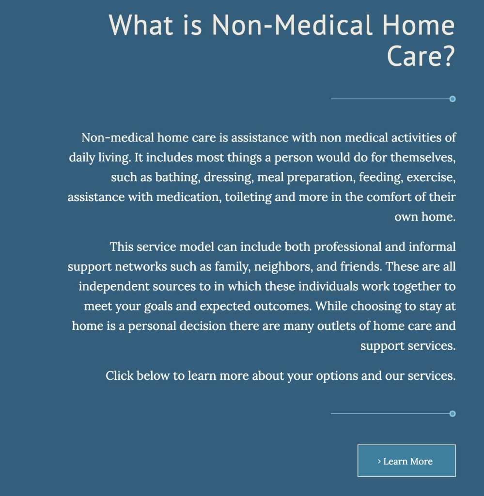
2. Typography & Visual System
Accessibility and readability were primary considerations throughout the visual design process.
Drawing inspiration from contemporary editorial design systems, I paired:
- A clean, highly legible sans-serif for navigation and interface elements.
- A warm serif typeface for headings and storytelling moments.
This combination allowed the experience to feel both trustworthy and approachable while supporting WCAG accessibility standards across devices and screen sizes.
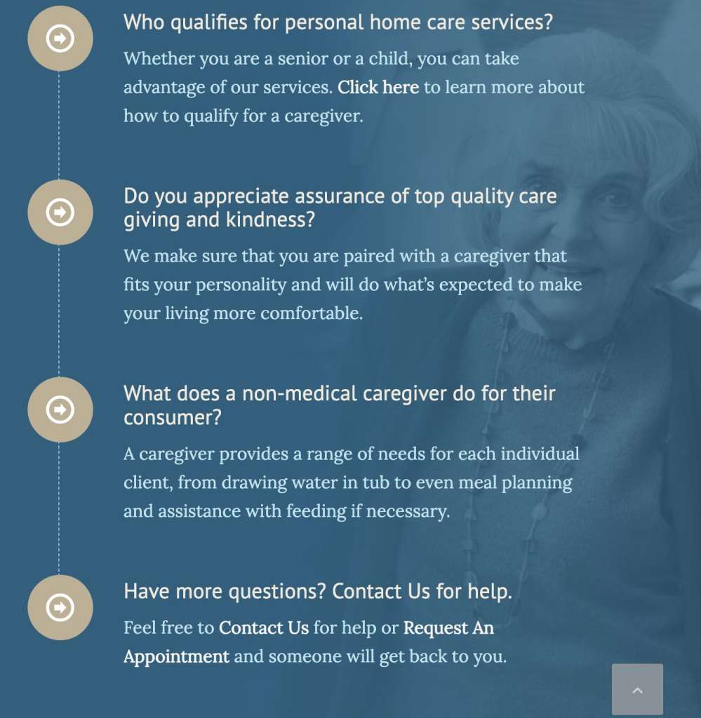
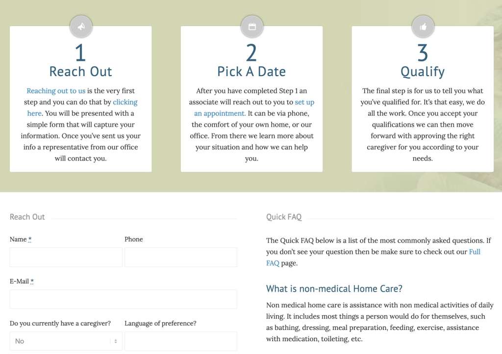
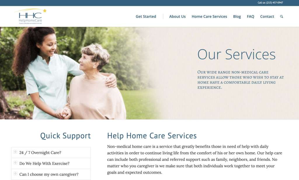
3. Information Architecture & Content Strategy
The site was structured around the emotional journey of users seeking care solutions.
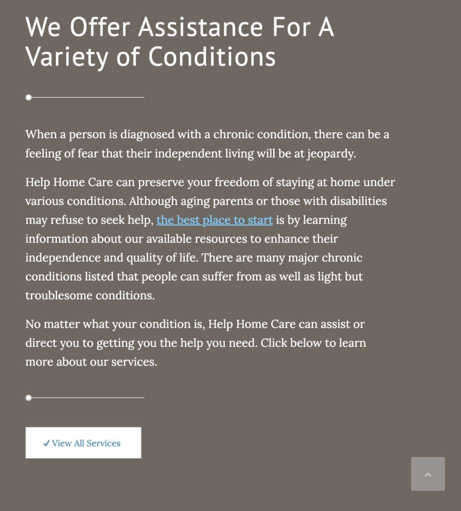
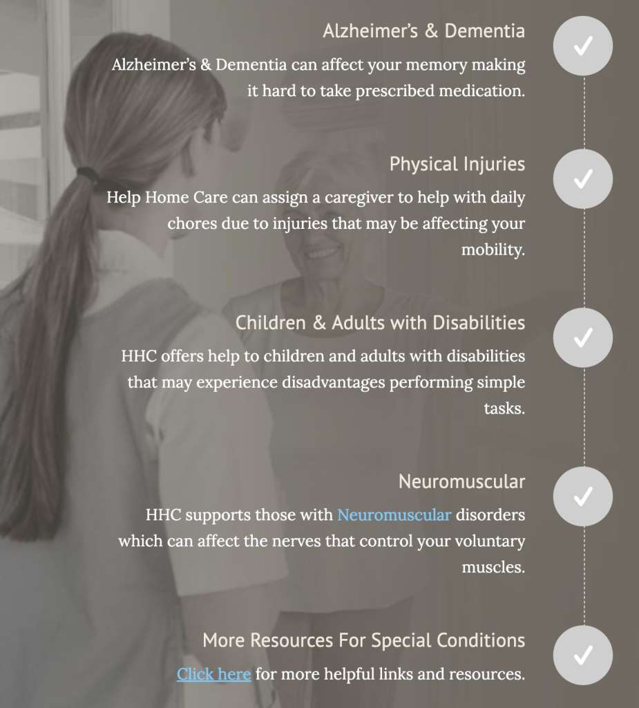
I helped shape the site’s content strategy by replacing institutional healthcare jargon with more empathetic, approachable language. Rather than focusing solely on services, the messaging emphasized joyful, dignified living and quality of life.
Client Training
Following launch, I conducted training sessions that enabled the HHC team to:
- Update content independently
- Publish blog posts
- Manage inquiries
- Maintain consistency across the site
Long-Term Sustainability
To support the startup’s growth, I established a workflow where the client retained ownership of day-to-day content management while I remained available for technical maintenance, security updates, and structural improvements.
Results & Takeaways
By combining healthcare-focused UX principles with strong brand strategy and front-end development expertise, I helped HHC launch a digital presence that punches well above its weight class.
The final product successfully communicates the organization’s key differentiator:
Small enough to care deeply. Professional enough to deliver confidently.
I wanted to give HHC a website suited for scalability, and a sustainable digital foundation capable of supporting future growth.